So when Steve asked for an Incrementalists logo with an hourglass, I immediately thought of a funny little bit of sacred geometry I discovered a long time ago. It all starts with the Star of David — Seal of Solomon if you're nasty:

(At each stage of this process, the most recent iteration that's been drawn will be in gray; previous iterations will be in black.)
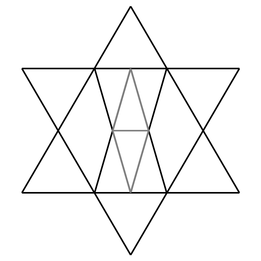
One thing you can do with this always-entertaining diagram is draw a couple more triangles inside it, each with vertices at the upper and lower vertices of the inner hexagon:

What you have at this stage, now, looks an awful lot like a Seal of Solomon with a Masonic square and level inscribed inside it. Hunh! I'm sure nobody has ever built an extensive esoteric narrative on that symbolism. But moving right along, we can draw a couple more triangles in the same iterative fashion:

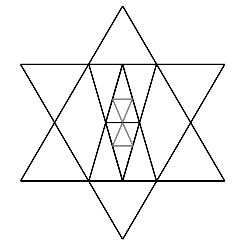
All this iteration actually visibly changes (if what we just did weren't highlighted in gray) is add a crossbar to the middle of the diagram. Okay. Continuing on:

Iteration four gives us a pretty little hourglass in the middle of the diagram. Iteration four is also the last "interesting" iteration; past this point, the triangles diverge from each other and just descend into sterile recursion.
(If you like, you can download the PSD with the geometry above as layers than can be played with.)
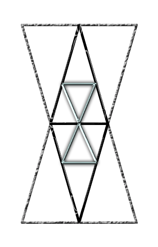
So that, then, is how I wind up submitting this as a possible Incrementalists logo:

As you can see, I've removed the outer Seal of Solomon, making something of an easter egg of the geometry the logo is derived from. We get not one but three (or more if you squint) hourglass shapes in the deal. It's complex enough to communicate that it bears specific meaning without being gratuitously complicated, is pretty easily reproducible, and has a classical flavor in its geometric orientation.
Drawing on this particular strain of sacred geometry does imply some reasonably strong connection between the Incrementalists and certain kinds of traditional occultism and secret society. Which, well, it's kind of hard to see them being completely uninvolved with, so that might work out fine. Above my pay grade, anyway.
(Also available in PSD format are the PSD version of this logo and the PSD version of this logo before any layer styles — the shininess and whatnot — were applied.)
Here's my treatment of Crater-in-the-book-cover-style. I'm putting it on a colored background so that it shows up properly (the stars on the cover aren't designed for a white background like this page has, or a black one for that matter), but the image itself has a web-ready transparent background.

Here's the PSD of Crater.